Choosing the right kitchen paint color can change how your space feels every day. It can make a small room look open, a busy family kitchen feel calmer, or a modern layout look more finished.
This guide shares kitchen paint color ideas based on real, lived-in scenes like sage green walls with white shaker cabinets, deep navy with brass hardware, and warm beige with marble countertops. Each color section includes simple styling ideas you can copy.
You will also find practical notes on lighting, cabinet pairings, and easy upgrades like tea towels, plants on the windowsill, and better hardware. These are the details that help Pinterest photos translate into a kitchen that works for your life.
Use the headings to jump to the mood you want, then take the tips to the paint store. You will know what to test, what finishes to choose, and how to keep the look on budget.
1. Soft Sage Green Kitchen Paint Color Idea
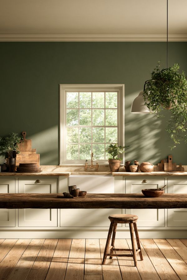
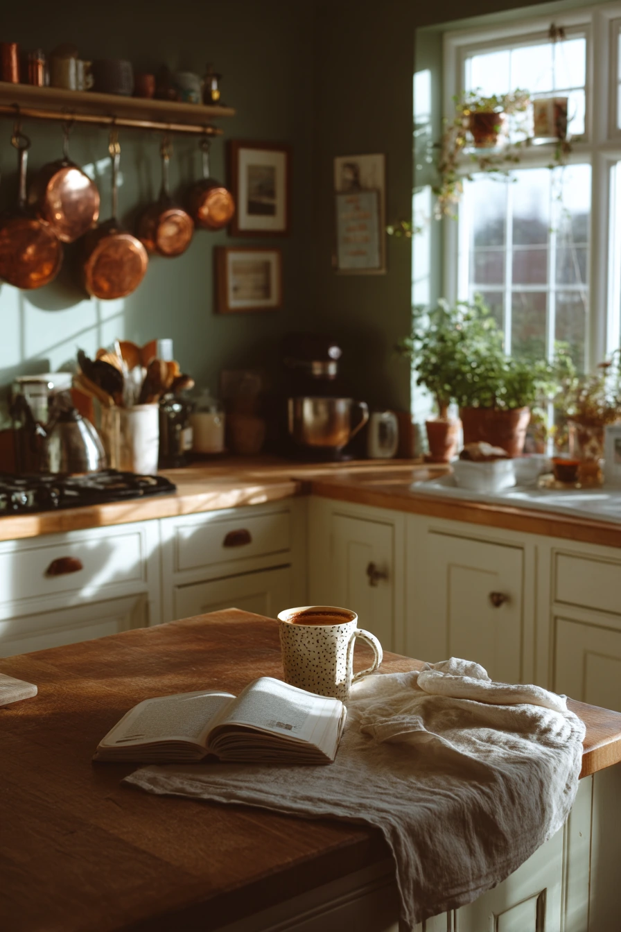
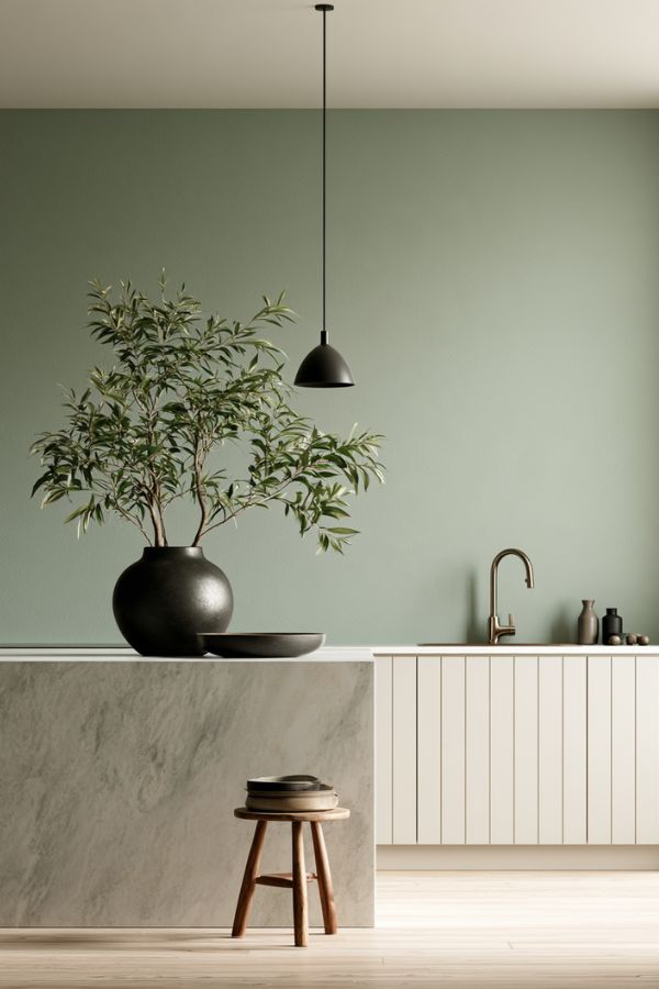
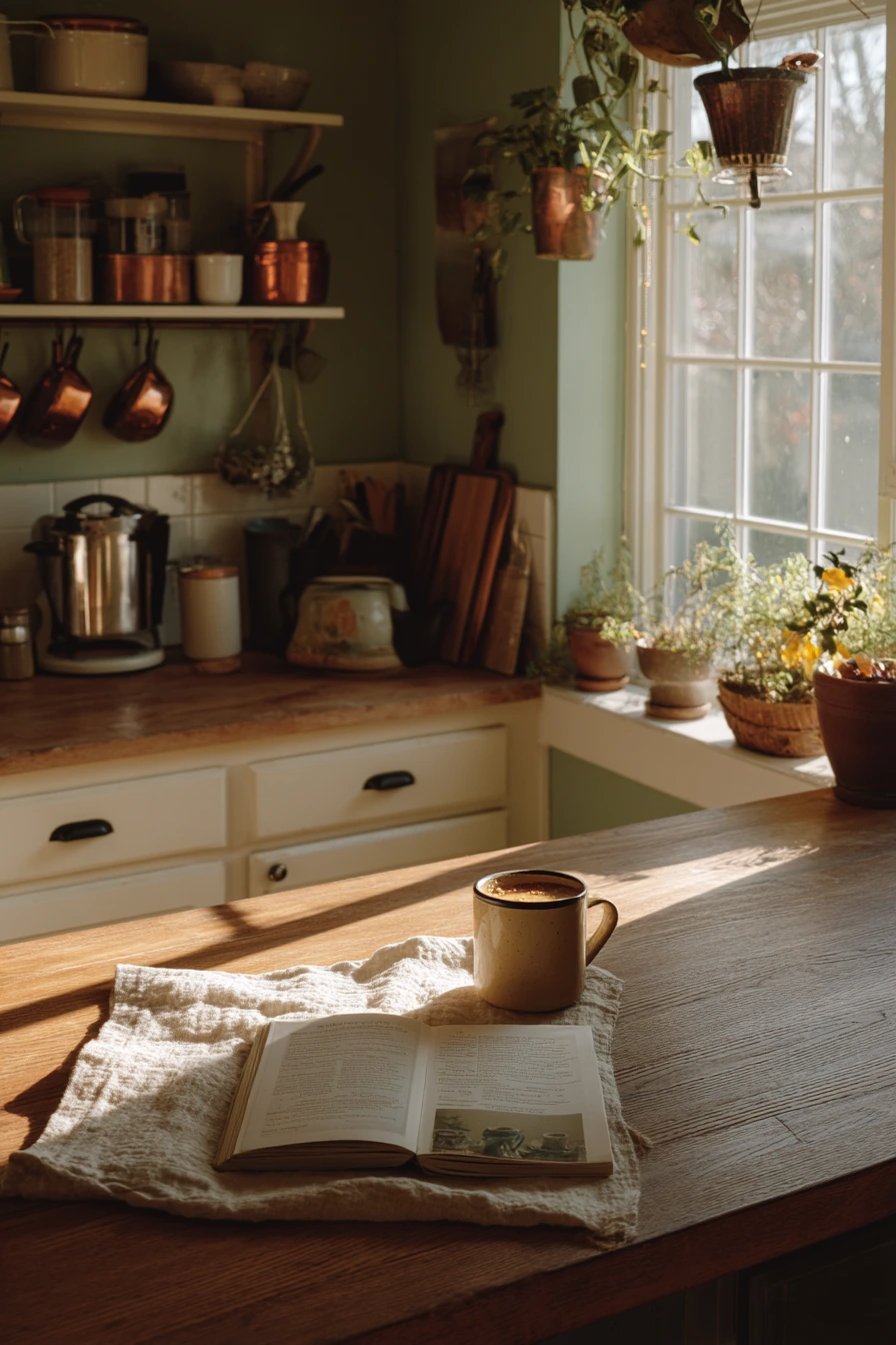
Soft sage green walls are a steady choice when you want a cozy kitchen that still feels fresh. In a space with white shaker cabinets and a wooden island, sage adds color without taking over. Morning light and plant shadows look especially pretty on this shade, so it works well near a bright window and potted herbs on the sill.
Sage is also forgiving in real life. It hides small scuffs better than bright white and looks good next to everyday items like a wrinkled linen tea towel, an open cookbook, and a mug of steaming coffee on the island. If you have hanging copper pots, sage is a natural match because the warm metal makes the green look softer.
To style it, keep the base simple and add texture. Mix wood, linen, and a few glossy pieces like ceramic bowls. If your kitchen feels a little flat, add contrast with matte black pulls or a darker faucet, then repeat that darker tone in one small item like a tray or utensil crock.
- Pick a muted sage, not a neon green, for an easy-to-live-with look.
- Pair it with white shaker cabinets and warm wood for a classic feel.
- Add herbs on the windowsill to tie the color to real greenery.
- Use copper, brass, or warm metals to keep the room from feeling cool.
- Choose a washable eggshell finish for walls in a busy cooking zone.
Pro Design Tip: Test sage samples on two walls, one in direct sunlight and one in shade, because green shifts a lot from morning to evening.
Budget Considerations: If repainting cabinets is not in the plan, update the look with new hardware and one large natural wood cutting board for warmth.
2. Deep Navy Kitchen Paint Color Idea for a Busy Family Space
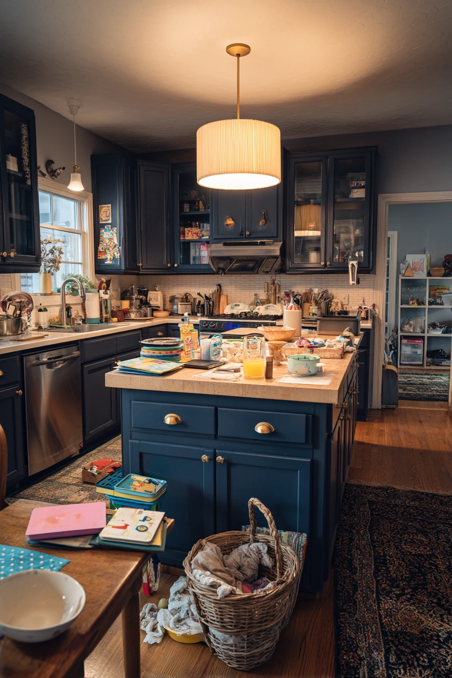
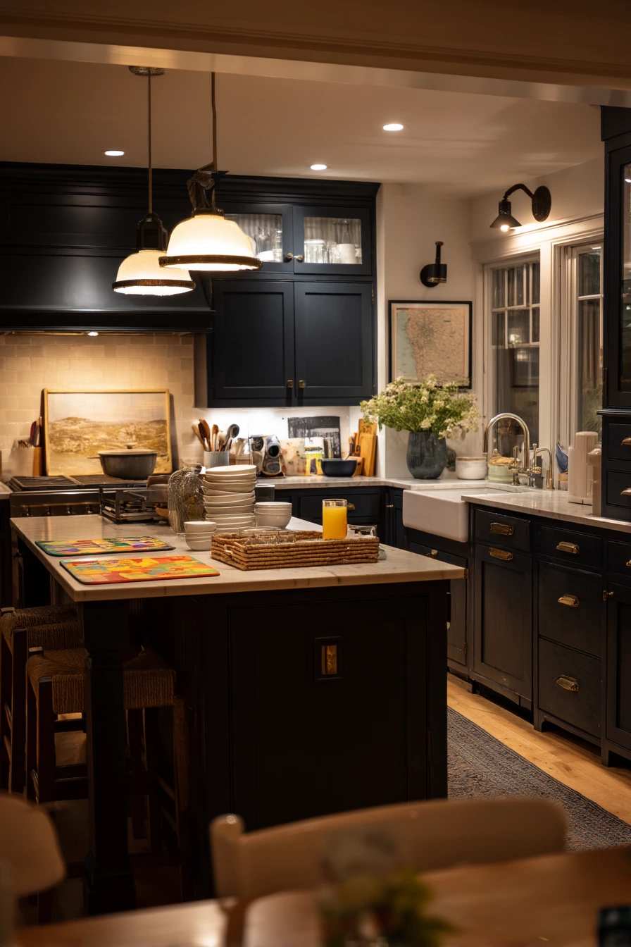
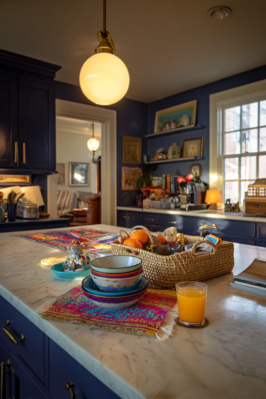
Deep navy walls can make a bustling family kitchen feel grounded. It is a bold color, but it can read like a neutral when you balance it with lighter pieces. Navy looks clean next to stacked ceramic bowls, white trim, and warm pendant lamps, and it hides fingerprints better than many mid-tone shades.
This color works well in real life because it supports the mess that comes with kids. Colored placemats, a toy basket by the island, and a half-drunk glass of juice will not feel out of place. Navy gives a strong backdrop, so small items look more organized even when the counter is not perfect.
For styling, choose a few warm accents so the space does not feel cold. Brass hardware is a great match and helps navy feel welcoming. Add wood in cutting boards, stools, or a simple fruit bowl. If you want a softer look, use creamy white walls on an adjacent area or add a light runner that breaks up the dark paint.
- Use navy on the walls and keep cabinets light for balance.
- Pick warm lighting, like soft white bulbs, to avoid a harsh look.
- Repeat brass hardware in a faucet or pendant details.
- Add storage baskets on the counter to corral kid items quickly.
- Bring in light textiles, like a striped towel, to brighten the scene.
Pro Design Tip: Choose navy in a satin wall finish for durability, then keep the ceiling a crisp white to lift the room.
Budget Considerations: If new brass hardware is too pricey, spray paint existing pulls with a quality metallic finish and seal it for better wear.
3. Sun-Drenched Yellow Kitchen Paint Color Idea with Rustic Charm
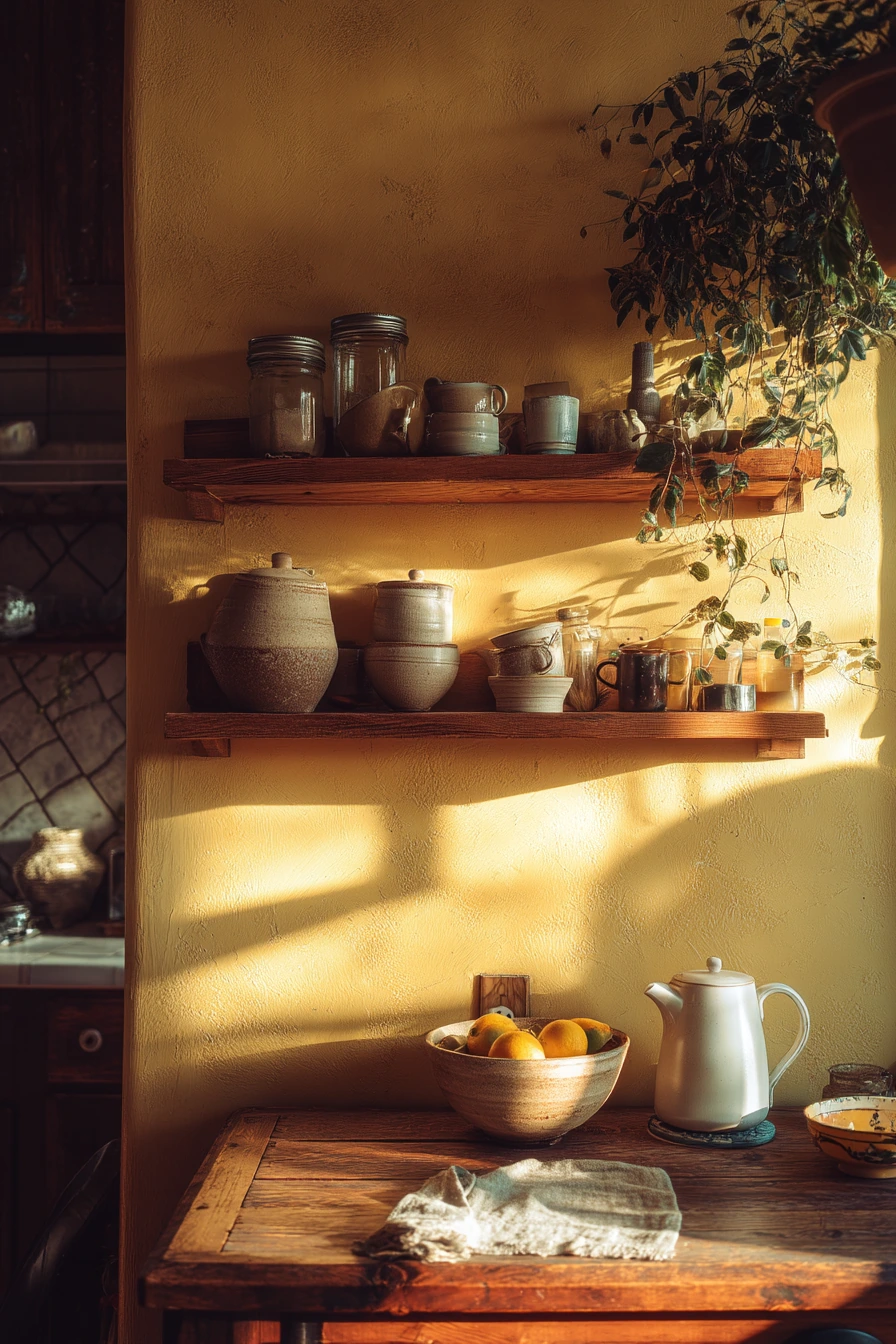

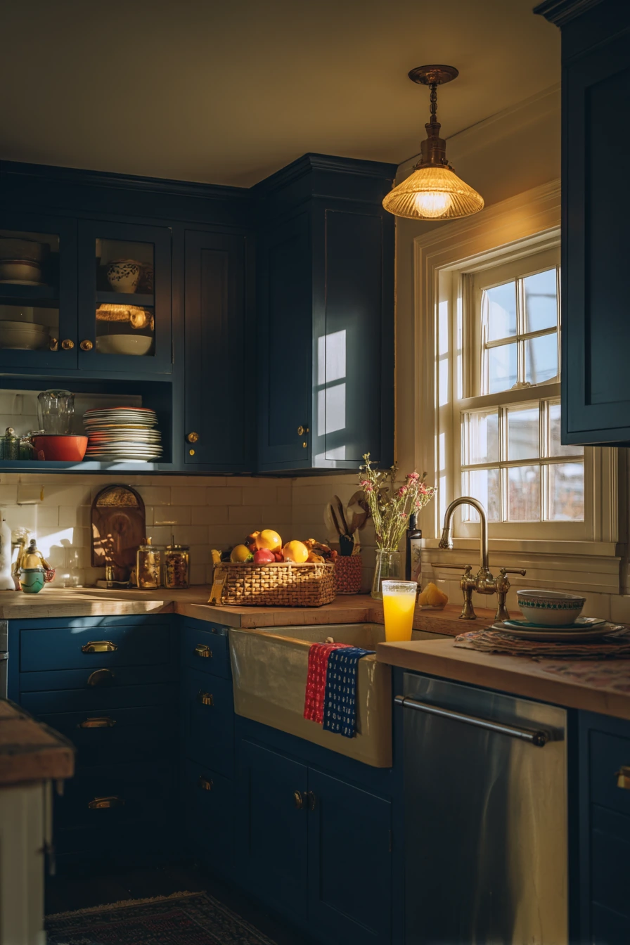
Sun-drenched yellow walls are a strong choice if your kitchen needs more warmth. Yellow can make mornings feel brighter, especially with natural light spilling across a rustic wooden table and a ceramic fruit bowl. It also pairs well with simple, worn-in details like slightly chipped open shelves and mason jars.
To keep yellow from feeling too loud, pick a softer, buttery tone instead of a sharp lemon. A gentle yellow looks more relaxed with a wrinkled linen dishtowel and a steaming kettle on the stove. It supports that everyday, lived-in feel without looking messy.
For styling, use natural materials and a few darker notes to ground the color. Add black or oil-rubbed bronze hardware, or bring in a dark wood stool. Plants help a lot here, since an indoor plant casting shadows can break up the wall and add calm. Keep countertop decor minimal so the walls stay the main feature.
- Choose a warm, muted yellow for a cozy look.
- Use open shelving with simple jars to keep the space light.
- Add a dark accent, like a black sconce or hardware, to ground the room.
- Style with linen towels and natural wood for a rustic feel.
- Use white dishes to keep the yellow from feeling busy.
Pro Design Tip: If the room gets strong sunlight, test yellow in the brightest corner first because it can look more intense at midday.
Budget Considerations: Keep existing shelves and refresh them with paint and new brackets instead of replacing with custom cabinetry.


4. Soft Lavender Kitchen Paint Color Idea for a Calm, Fresh Look


Soft lavender walls add a gentle color that still feels neutral. It is a good fit if you want something different from gray or beige but you still want an easy, calm kitchen. Lavender works nicely with warm under-cabinet lamps and light counters, making prep time feel softer.
This shade also fits real cooking life. A wooden cutting board with knife marks, an open recipe notebook, and even a faint smudge of flour will look normal, not staged. Lavender has a quiet look that supports both clean lines and a slightly messy counter during dinner prep.
To style it, bring in warm woods and simple glass pieces. A glass vase with fresh flowers looks natural against lavender, and it adds height without clutter. Keep metals warm if you can, like brass or aged gold, to avoid a cold, icy feeling. If you have a lot of stainless steel, add a few wood and textile pieces so the room stays balanced.
- Pick a gray-leaning lavender for a more modern, calming tone.
- Use warm task lighting so the paint does not look too cool at night.
- Style counters with one vase and one functional item, like a crock for utensils.
- Add wood cutting boards and woven pieces to warm the color.
- Pair with creamy white trim for a soft contrast.
Pro Design Tip: Lavender looks best when you limit competing colors, so keep small items in white, wood, or clear glass.
Budget Considerations: Fresh flowers can add up, so use grocery store stems or switch to a small potted plant for longer-lasting color.


5. Charcoal Gray Kitchen Paint Color Idea for an Industrial Loft Mood


Charcoal gray walls with a matte finish create a modern, industrial look that feels grown up. In a loft-style kitchen, charcoal pairs well with concrete countertop textures, metal stools, and large windows. It also works for evening light, when the room shifts to a softer, moodier tone.
This color is practical if your kitchen is also a work space. A laptop on the counter, scattered magazines, and a half-filled wine glass can fit the vibe without looking out of place. Charcoal is strong enough to handle visual clutter, which is helpful in an open layout where the kitchen is always in view.
To style it, add a few warm pieces so the room does not feel harsh. Bring in wood accessories, like a tray or cutting boards, and choose warm bulbs in pendants. If your kitchen has stainless steel, charcoal makes it look sharper, but add one soft element like a linen towel or a textured runner to keep the space comfortable.
- Use matte or low-sheen paint to match the industrial look.
- Pair charcoal with concrete, black metal, and warm wood accents.
- Choose warm pendant lighting to soften the gray.
- Keep counters edited, then store extras in closed bins or drawers.
- Repeat black accents in stools, faucets, or picture frames.
Pro Design Tip: Balance charcoal with at least one light, large surface, like a pale backsplash or lighter countertops, so the room does not feel heavy.
Budget Considerations: If concrete counters are not in budget, use a concrete-look laminate or peel-and-stick countertop film for a similar feel.


6. Muted Teal Kitchen Paint Color Idea with Light Oak Cabinets

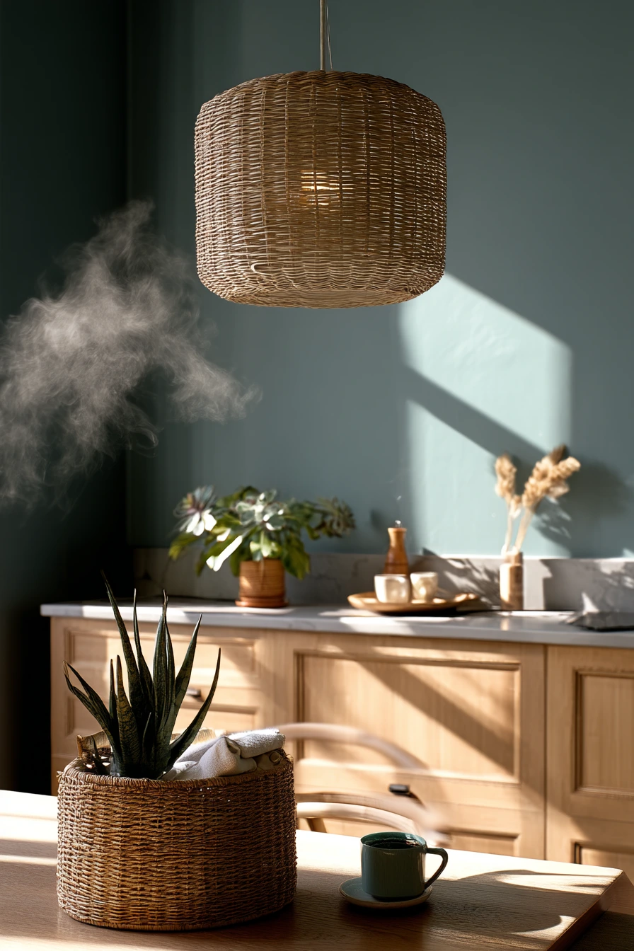
Muted teal walls bring in color while staying calm and livable. With light oak cabinetry, teal creates a soft contrast that feels clean and relaxed. It is a great option if you like a minimalist look but want more personality than plain white.
Teal also plays well with everyday textures. A wicker basket with linens, a steaming coffee mug, and a small potted succulent all look right at home. Since this shade sits between blue and green, it can lean cool or warm depending on your bulbs and the time of day, so lighting matters.
To style it, keep decor simple and repeat natural materials. Wicker, wood, and matte ceramics help teal feel grounded. If you want a more modern edge, use black or brushed nickel hardware. For a softer look, choose warm brass and add a cream runner. A single pendant lamp casting soft shadows can become the focal point if the rest of the room stays uncluttered.
- Choose a gray-leaning teal for a quieter, modern color.
- Pair with light oak cabinets to keep the space airy.
- Add woven storage like baskets to make the kitchen feel lived in.
- Use simple plants, like a succulent, to echo the green tones.
- Pick a backsplash in white or warm cream to keep the palette balanced.
Pro Design Tip: Teal looks cleaner when you match undertones, so keep whites either warm cream or crisp cool white, not both.
Budget Considerations: If replacing hardware is costly, focus on one upgrade, like a new faucet, and keep the rest the same.


7. Terracotta Kitchen Paint Color Idea for Warm, Golden Evenings


Terracotta walls add warmth and an earthy feel that works well in kitchens with rustic wood. This color looks especially good in evening sun, when it picks up golden tones and makes the room feel comfortable. If you like tactile textures, terracotta is a strong backdrop for linens, pottery, and plants.
It also fits real cooking moments. Scattered ceramic plates, a jar of olive oil with drips, and textiles draped over chairs feel natural with this shade. Terracotta can hide small marks and splashes better than pale paint, which is helpful if your kitchen is busy.
To style it, mix in lighter neutrals so the room does not feel too dark. Try cream dish towels, a light runner, or pale stoneware. Plant shadows on a textured wall add movement, so consider adding a larger plant near a window. If you have a rustic wooden island, keep the countertop mostly clear and use one large bowl or tray as your main styling piece.
- Pick a terracotta that is muted, not bright orange.
- Use cream and warm white accents to keep the palette light.
- Layer in textiles like linen towels and simple chair cushions.
- Add pottery or ceramic dishes that match the earthy tones.
- Use greenery to break up the warm wall color.
Pro Design Tip: Terracotta looks best with warm metals, so choose brass, copper, or aged bronze instead of shiny chrome.
Budget Considerations: If you cannot replace counters, use a large neutral runner and matching towels to soften and update the overall look.

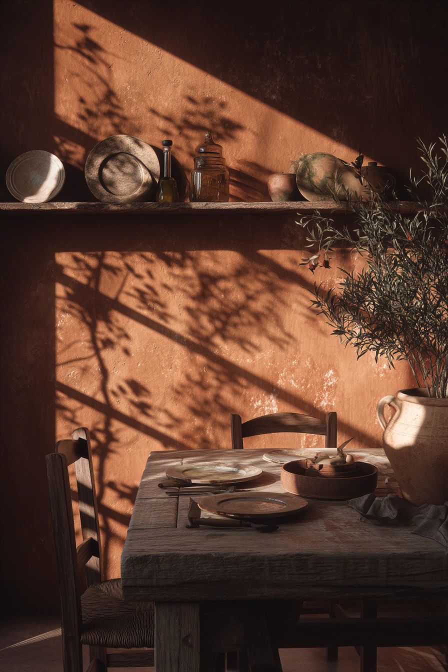
8. Powder Blue Kitchen Paint Color Idea with Coastal Light


Powder blue walls are a soft way to add color while keeping the room bright. With white beadboard and a sun-bleached wooden countertop, this shade creates a calm, coastal look that still feels practical for daily use. It is especially nice in kitchens with sheer curtains and gentle daylight.
Powder blue also works well with small everyday items. An open cookbook, ceramic coffee mugs, and a small potted herb look clean against this backdrop. The color is light enough to reflect natural light, so it can help a dim kitchen feel more open without going full white.
To style it, keep the palette simple and repeat a few key materials. Use white dishes, clear glass, and light wood. Add texture with woven baskets or a striped towel. If you want a little contrast, use matte black hardware, but keep it minimal so the room stays soft. A light breeze moving curtains can make the space feel airy, so avoid heavy window treatments.
- Choose a pale, dusty blue instead of a bright primary blue.
- Pair with white beadboard or simple trim for a clean look.
- Use light wood counters or accessories to add warmth.
- Style with herbs and simple ceramics for an easy, everyday feel.
- Add one contrast color, like navy in a small rug or towel, to keep it interesting.
Pro Design Tip: Use powder blue on walls and keep the ceiling bright white so the color stays light and not gloomy.
Budget Considerations: Beadboard can be expensive; use beadboard-look paneling or paint existing trim a crisp white for a similar effect.

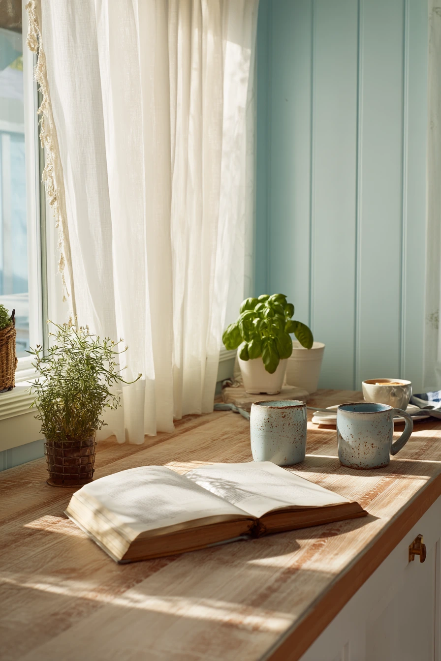
9. Deep Forest Green Kitchen Paint Color Idea with Copper Accents
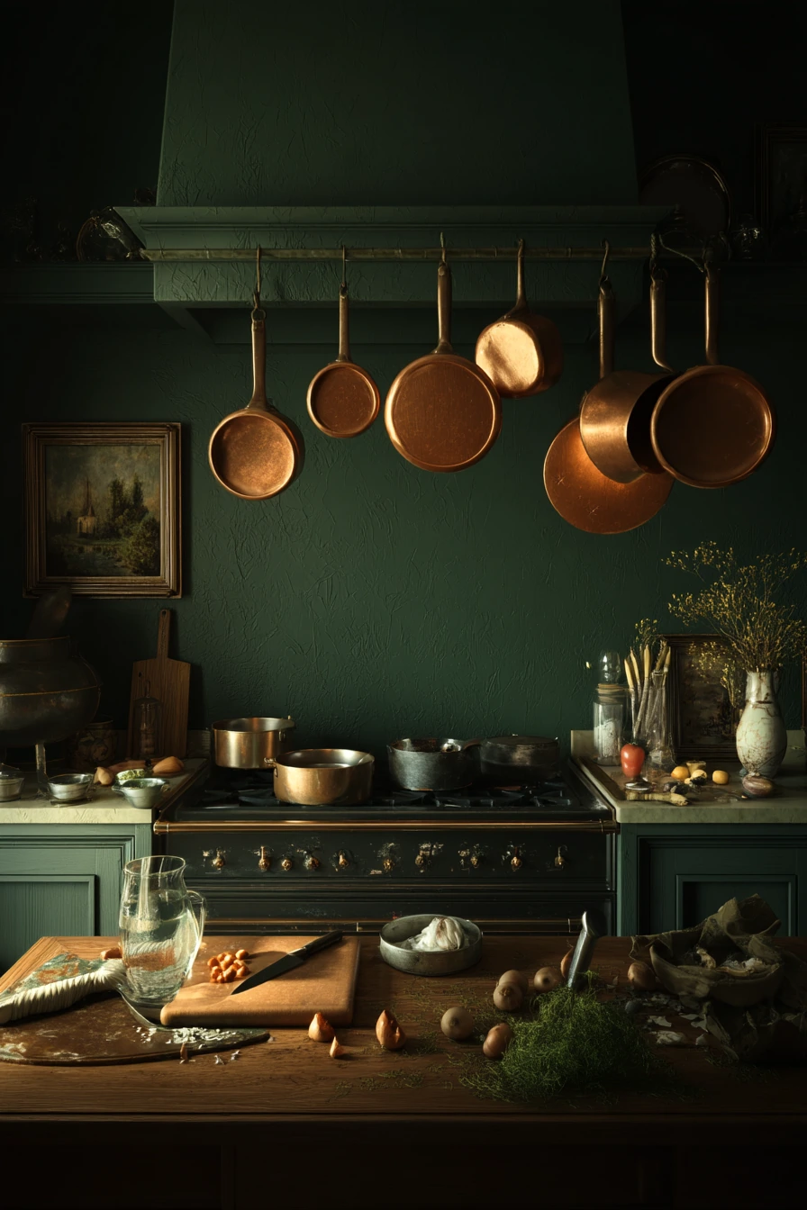

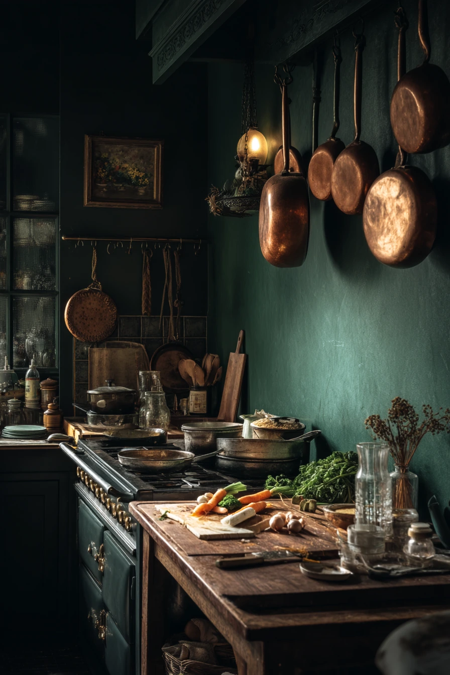
Deep forest green walls create a rich, classic kitchen that feels both cozy and strong. This shade looks great with a professional-style stove and warm lamp glow, since the green adds depth without feeling too trendy. It also pairs naturally with copper pans, which bring warmth and shine.
Forest green can handle real kitchen chaos. A chopping board with scattered ingredients, a half-full glass of water, and tools on the counter still look fine because the wall color is already bold and grounded. This makes it a smart choice if you cook often and want a space that looks good even when it is not perfect.
To style it, focus on warm neutrals and a few standout metals. Copper and brass both work well, and wood tones help the room feel welcoming. Keep the backsplash light, like off-white tile, so the room does not feel too dark. If you want a cleaner look, store small items and leave only a few daily tools out, like a crock and one cutting board.
- Pick a green with depth, not a bright emerald, for a classic feel.
- Pair with warm metals like copper and brass to soften the darkness.
- Use a light backsplash to keep the room balanced.
- Add wood accents, like cutting boards, for warmth and texture.
- Use layered lighting so corners do not feel shadowy.
Pro Design Tip: Forest green looks best when you repeat it in small ways, like a tea towel or art print, so the color feels intentional.
Budget Considerations: Real copper can be pricey; mix in one or two copper pieces and use copper-toned hooks or rails for the rest.

10. Creamy Beige Kitchen Paint Color Idea for a Timeless Neutral Base
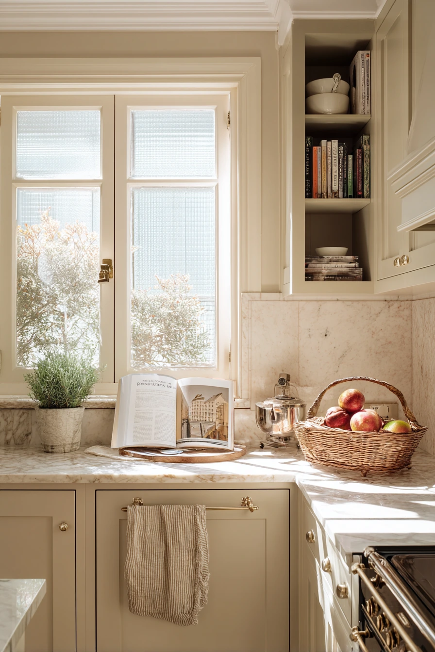

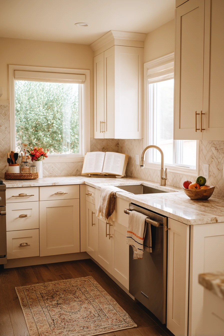
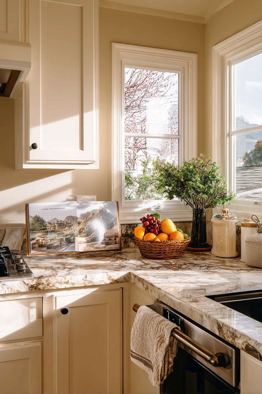
Creamy beige walls are a safe, timeless choice when you want a kitchen that feels warm and bright. Beige works especially well with marble countertops, since the soft color helps the stone look richer and more natural. It also suits a wide-angle, open kitchen where you want everything to feel connected.
This shade supports everyday routines without looking dull. A cookbook propped open, a tea towel draped over the oven handle, and a small basket of fresh fruit all look easy and real. Beige is also flexible, so you can change your decor seasonally without repainting.
To style it, build your contrast with hardware and textiles. Black pulls give a crisp look, while brushed brass makes it warmer. Add a little pattern through a rug or Roman shade, then keep counters mostly clear so the marble can stand out. If you want more depth, use a slightly darker beige or greige on an island and keep the walls creamy.
- Choose a beige with warm undertones to avoid a flat look.
- Pair with marble or marble-look counters for a classic style.
- Add contrast through hardware, lighting, or a darker island color.
- Style with simple baskets and one fruit bowl for an everyday feel.
- Use washable paint so splatters wipe off easily.
Pro Design Tip: Match beige to your fixed finishes first, like countertops and floors, then choose a wall paint that supports those undertones.
Budget Considerations: If marble is not in budget, a marble-look quartz or laminate can give a similar feel with easier maintenance.
These kitchen paint color ideas show how different shades work in real homes, from soft sage green and powder blue to deep navy and forest green. Each option can look great when it matches your light, cabinets, and the way you use your kitchen.
Before you commit, test samples in morning and evening light, and decide what you want the room to feel like day to day. Then use small styling changes, like hardware, textiles, plants, and warm lighting, to finish the look without overspending.
FAQ
1. What is the best paint finish for kitchen walls?
Eggshell or satin paint is usually ideal for kitchen walls because it is easier to clean than flat paint. These finishes offer a smooth appearance and help resist everyday stains, splashes, and marks.
2. How do I choose a kitchen paint color that matches my cabinets?
Consider the undertones of your cabinets and countertops before selecting a wall color. Choose shades with complementary warm or cool undertones to create a balanced and harmonious kitchen design.
3. Are dark kitchen paint colors difficult to maintain?
Dark paint colors can show dust, grease, and fingerprints, although they may hide some scuffs better than lighter shades. Regular cleaning and proper lighting can help keep your kitchen looking fresh and attractive.
4. Will yellow kitchen walls make my kitchen look outdated?
Yellow walls can look timeless when you choose a soft, warm shade and pair it with white shelves, natural wood, and neutral textiles. The right combination creates a cheerful and inviting kitchen without feeling old-fashioned.
5. Does sage green work well in a small kitchen?
Yes, sage green is an excellent choice for a small kitchen because its muted tone creates a calm and airy atmosphere. Pair it with white cabinets, light countertops, and natural lighting for a fresh, spacious appearance.
6. What kitchen paint color ideas work best with brass hardware?
Navy blue, forest green, sage green, warm beige, and terracotta complement brass hardware beautifully. These color combinations add warmth, contrast, and sophistication while making brass fixtures stand out.